National Grid
CASE STUDY
I’ve been fortunate to work on many projects at National Grid from intranet design, enterprise apps and this project, the UX design of electricity transmission SCADA displays.
Project Background
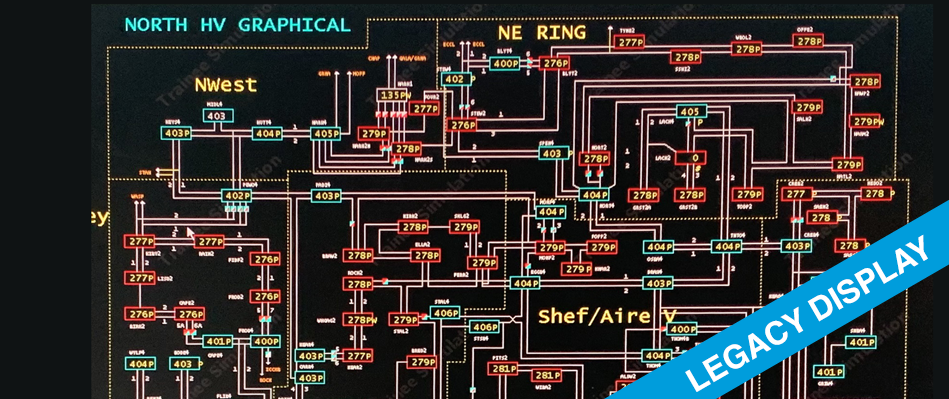
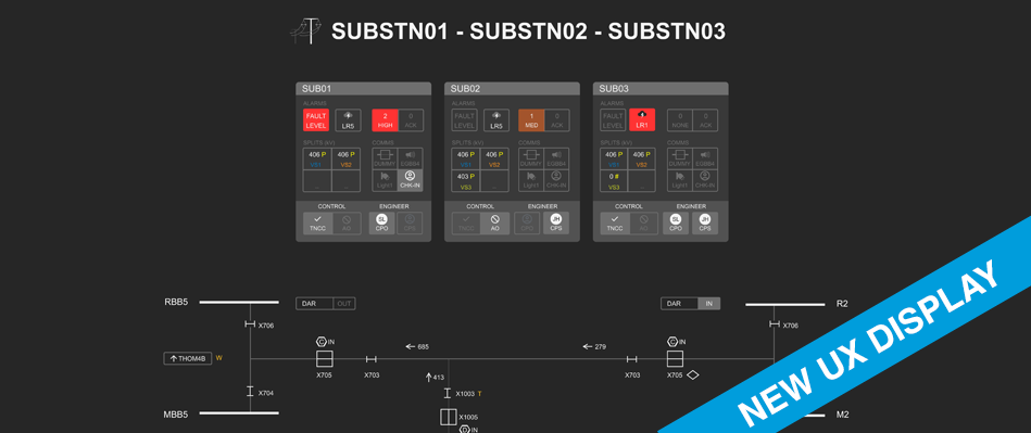
My project brief was to help redesign (at least create the UX Standards) for 3,000+ legacy displays used by different role users. Control room engineers, typically use 3 X 43-inch displays per workstation. Field engineers use tablets and other roles requiring laptop access. The legacy displays should be consolidated, and new displays be consistent, and have improved user experience and a safety-first approach.
Goals
Publish UX Scada Display Standards that can be used to convert legacy displays that are consistent with improved usability and accessibility, and take advantage of the new SCADA software and display technologies.
Constraints
The UX Scada Display Standards had to include different display types (for different audiences) including operational, safety, world view, and more.
Gestalt Principles
SCADA Displays are information-dense. To simplify their visual appearance, enhance situational awareness, and improve usability and accessibility, Gestalt Principles were extensively applied.
UX Process and Approach
Overall the project followed Agile methods with the UX specific processes following “Design Thinking” processes.
Microsoft Teams was used to collaborate with onsight, remote and offshore development teams.
Empathise
Understanding the user’s needs via interviews, including user roles and tasks. Situational awareness, and safety issues. The environment and ergonomics of the control room with operational observations. Review of legacy SCADA screens and relevant safety standards.Define (the problem)
Team discussion to collaboratively review legacy screens and define the new desired UX,IDEATE
Brainstorming ideas collaboratively, and sharing concept sketches. Usually done in a Teams Meeting.Prototype
I created (and shared for review) concepts, sketches, wireframes and click-through prototypes. Sometime we implemented prototypes in the new technology to check for technical constraints.Test
Face-to-face walkthroughs via Microsoft Teams. All meetings were recorded for offline review and to share with stakeholders who couldn’t make the live meetings.
Feedback was given at any stage, designs were iteratively refined and selected (or all) the stages of the “Design Thinking” process repeated until the team converged on an approved solution.
UX deliverables
Personas (supplied by client)
Usability & Accessibility recommendations
Wireframes
Prototypes/Mockups
Concept diagrams
Visual design
SCADA Symbol design
Stylegude and specifications for developers
Stakeholder presentations and visual communications
Video walkthroughs
Colours
All SCADA displays were initially designed using a greyscale palette intended to reduce eye strain and improve text legibility (contrast ratios of WCAG 2 AA or better). Later a colour palette was developed for alarms (high, medium, low) using hot temperature colours, (reds, oranges, yellows) along with cooler colours for high-voltages. Only tints of colour were used never 100% solid.
Design System
All the UX recommendations were documented and or implemented using the new SCADA display technology so that legacy screens could be converted more easily and consistently.
3 Design Language Components
SCADA UX Style Guide
I authored this document which explains the justification and explanation of the UX principles and why these are important with examples.SCADA Display Standards
This was authored by other members of the display team and was based on my UX recommendations. This document explains how to create new displays using the symbol libraries and templates using the new technology.SCADA Symbol libraries and display templates implemented in the new technology. These are reusable components that can be used to create new displays consistently.


