Gestalt Psychology & Visual Perception
An explanation of Gestalt Principles, especially regarding visual perception. How knowledge of these principles can improve a digital user experience and some examples of my projects demonstrating this.
The Rabbit-Duck illusion. Many people see both as their brain switches between seeing a rabbit or a duck. "originally noted" by American psychologist Joseph Jastrow (Jastrow 1899, p. 312; 1900; see also Brugger and Brugger 1993).
Our mind is optimised to see structure
We see structures and patterns all around us. Our eyes receive information and our brain processes this as quickly as it can taking lots of short-cuts. It turns out that what our brain perceives, isn’t always what our eyes are seeing.
Understanding Gestalt Principles of visual perception enables a UX Designer to create digital user experiences (graphical user interfaces) that visually and intentionally communicate meaning. For example, communicate what’s most important, less and least important, or show structure, lead the users’ gaze to a call-to-action, draw attention to an alarm, or show when everything is OK at a glance.
Do you see a vase or faces or both? Example of Gestalt Principle of Figure-Ground. Do you perceive the objects of focus (figure) or background (ground)?
Old woman young woman? First appeared on a German postcard in 1888, but was popularised by British cartoonist William Ely Hill in Puck Magazine 1915.
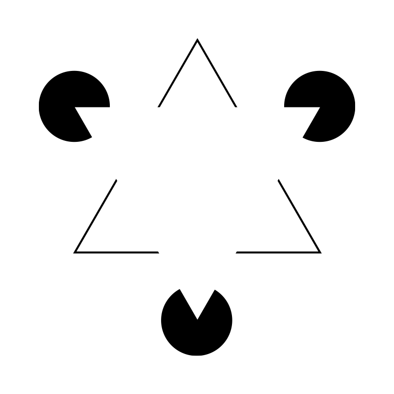
Do you see triangles? There aren’t any! This is known as the Kaniza Triangle, first described by the italian psychologist Gaetano Kanizsa in 1955.
Can you see the 4 animals in the Pittsburgh Logo?
Can you see a dog?
Gregory R (2001) The Medawar Lecture 2001 Knowledge for vision: vision for knowledge. Phil Trans Biol Sci.
Another zoo logo example. Can you see the animals in the Cologne Zoo logo.
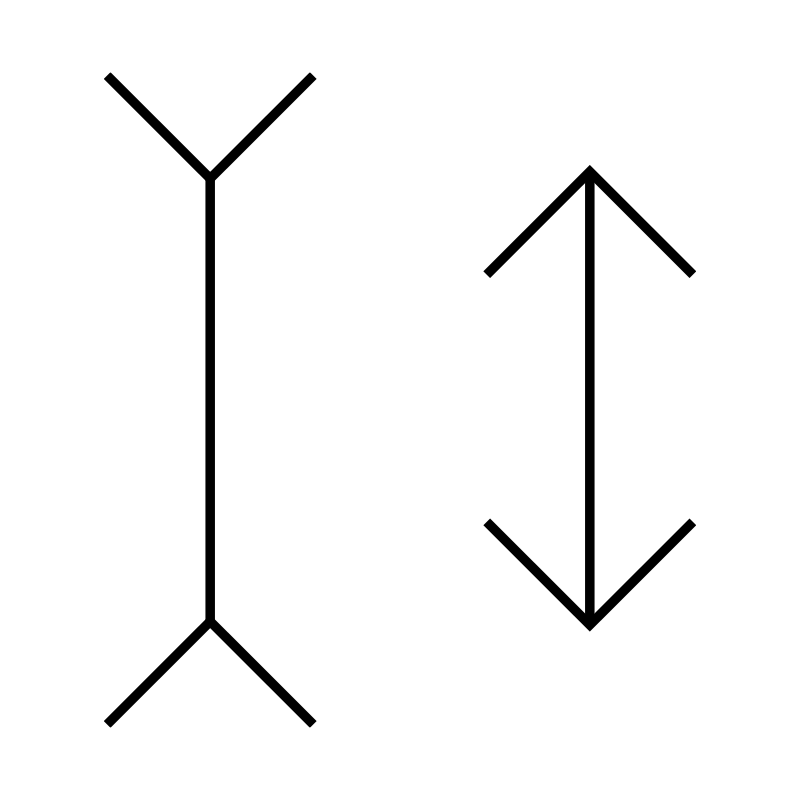
Which line is longer? They are both the same length! This Müller-Lyer optical illusion makes it look like the lines are different lengths.
Do you see a face in these clouds? Pareidolia is the phenomenon of seeing objects, faces, or other things in ambiguous images.
Common Gestalt Principles
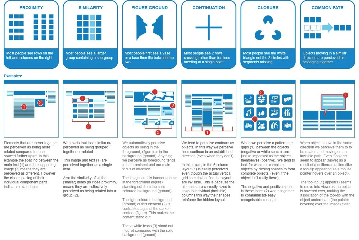
I created this Gestalt Principles graphic some years ago, to explain the principles I used to improve the UX of a Sharepoint intranet. I explained to my client that these principles were documented by German psychologists in the 1920s and were called Gestalt Principles. Gestalt, meaning “unified whole”. In other words, it is a short-hand way of saying, that we perceive individual elements we see as a whole. However, while they liked the result the explanation, however, wasn’t understood very well.
I now use a much simpler explanation of what and how I use Gestalt Principles. It’s a four-letter acronym, CRAP, (Contrast, Repetition, Alignment and Proximity). I first came across CRAP reading a great book called “The Non-Designers Design Book” by Robin Williams.
“The Non-Designers Design Book”
by Robin Williams.
Where I first came across the acronym CRAP representing a subset of the Gestalt Principles and much easire to remember.
Now I just talk C•R•A•P
My over-simplistic explanation
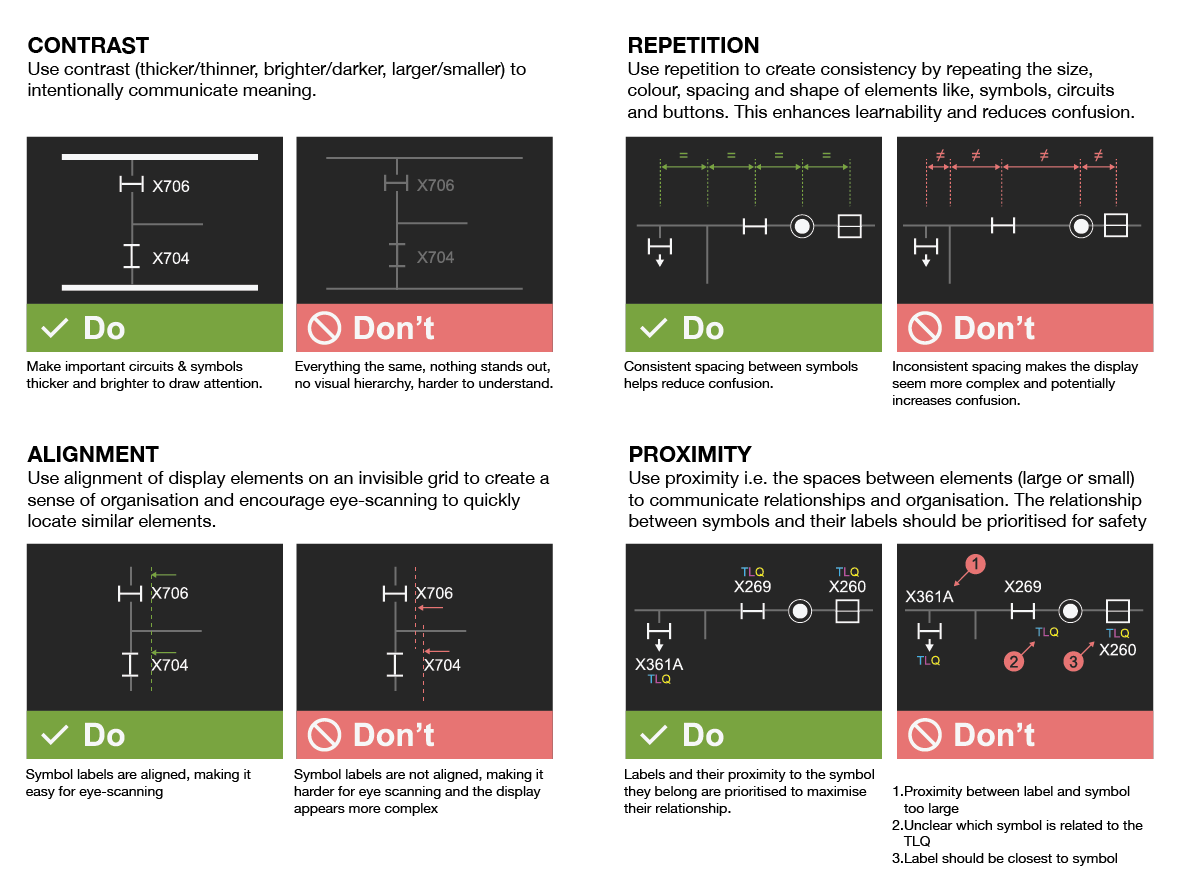
Contrast
Larger/smaller, Thicker/thinner, Brighter/darker
Foreground/background.Repetition
Consistency by repeating the size, colour, spacing and shape of, symbols, circuits, and buttons. To enhance learnability and reduce confusion.Alignment
Using an arrangement of elements on an invisible grid creates a sense of organisation and encourages eye-scanning that makes it easier to quickly locate similar elements.Proximity
The spaces between elements (large or small) can help communicate relationships and organisation.
Today I explain and apply Gestalt Principles in a shortened or subset form, using the acronym CRAP, that I first came across reading a great book called “The Non-Designers Design Book” by Robin Williams. I also created a simpler image to explain this:
“CRAP” UX Design
So by intentionally managing contrast, repetition, alignment and proximity, means I can deliberately communicate meaning.
Here are some examples from an electricity transmission SCADA project with incredibly information-dense displays (electricity transmission circuit diagrams). I used Gestalt Principles to visually simplify them, improve situational awareness (safety) and enhance the overall UX.


