Content Design With Fish & Chips
Applying UX principles to make content more usable.
Introduction
I was hired by a multinational electricity and gas utility company National Grid a lead UX Architect to organise and execute some UX research and usability tests ahead of and in preparation for a new intranet rollout based on new software (Unily).
Usability Test Results
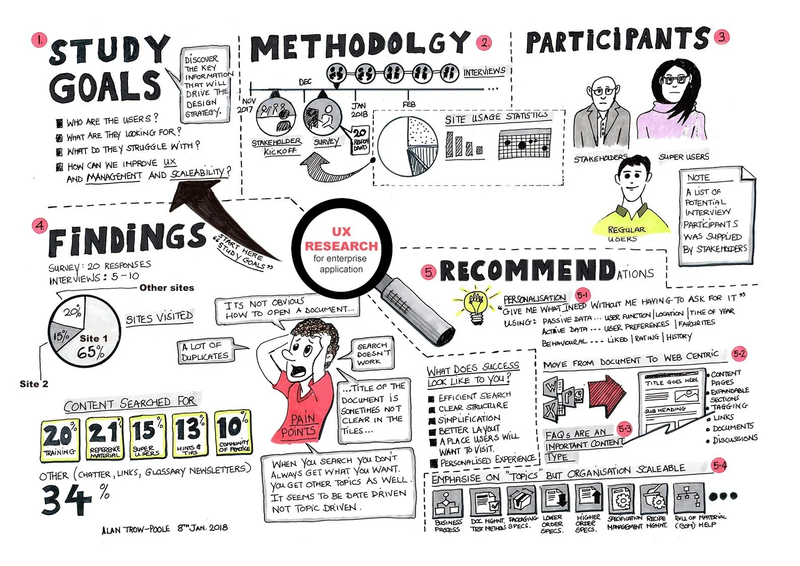
I completed the research, and usability tests and analysed survey/questionnaire feedback. I then presented my findings to the stakeholders (see my sketch) summarising the main findings and recommendations. In summary, these were the need for:
Improved search – Searching for content was extremely slow and search results were often not relevant. Users frequently shared lists of intranet page links, with their colleagues, to help avoid them using search.
More useful Home page – The “home” mostly featured news without personalization.
Accessibility issues – Issues were discovered around typography and too much reliance on colour only to communicate meaning
and…
4. Poor content — Was highlighted as the biggest issue. It was often out of date, inconsistent, duplicated, hard to understand, and poorly organised (and often boring).
Sometimes, particularly after lengthy research, stakeholders want a quick and easy way to remind them of the your research methods, who participated, the conclusions and your recommendations. I created this sketched infographic I to summarises all the main points, at-a-glance, saving a lot of time, especially for busy stakeholders.
So what?
Can’t we just make the “search” faster?
We knew that the intranet “content” needed work but, to show progress early, maybe improving the speed of the “search” (using the same content) would be a welcome quick fix.
After implementing the new “faster” search, I organised more usability tests. The user satisfaction scores were much worse than before! The users were really not happy. Why? It turns out, we had just made it much easier and faster to find (the same) old bad content!
Clearly, a “lift and shift” of old content with faster search was not an option.
Applying UX Principles to improve “content”
It was relatively easy to respond to the first 3 research recommendations, especially using the new software.
Improved search (but not a “Silver bullet”)
More useful Home page - adding personalization.
Accessibility issues – Most accessibility issues were fixed by increasing contrast ratios to meet WCAG 2.0 level AA or AAA standards.
However, item 4) Poor “content”, would require more time and consideration.
What do intranet users want?
Research
I did more research this time with a focus on content, theses research tasks included:
User interviews
Contextual Inquiries observing how users interact with the intranet during their day-to-day work
Published another company-wide survey asking users to provide qualitative feedback and rate specific content areas of the intranet
I looked at published reviews of other best-in-class intranets
We had some web analytics we could review and reveal the most popular search terms and then derive the content that was intended to support these
I did an Expert Review (heuristic evaluation) to understand how current content was organized and if there were any opportunities for improvement, (information hierarchy, visual perception, usefulness, and effectiveness).
I also evaluated the use of graphics to understand if they were useful, efficient, had a visual narrative, were on-brand, or just random “eye candy”.
Help users do their job
I discovered that most intranet users aren’t primarily looking for entertainment or for interesting news articles (although many do). Instead, most users are looking for help to do their job.
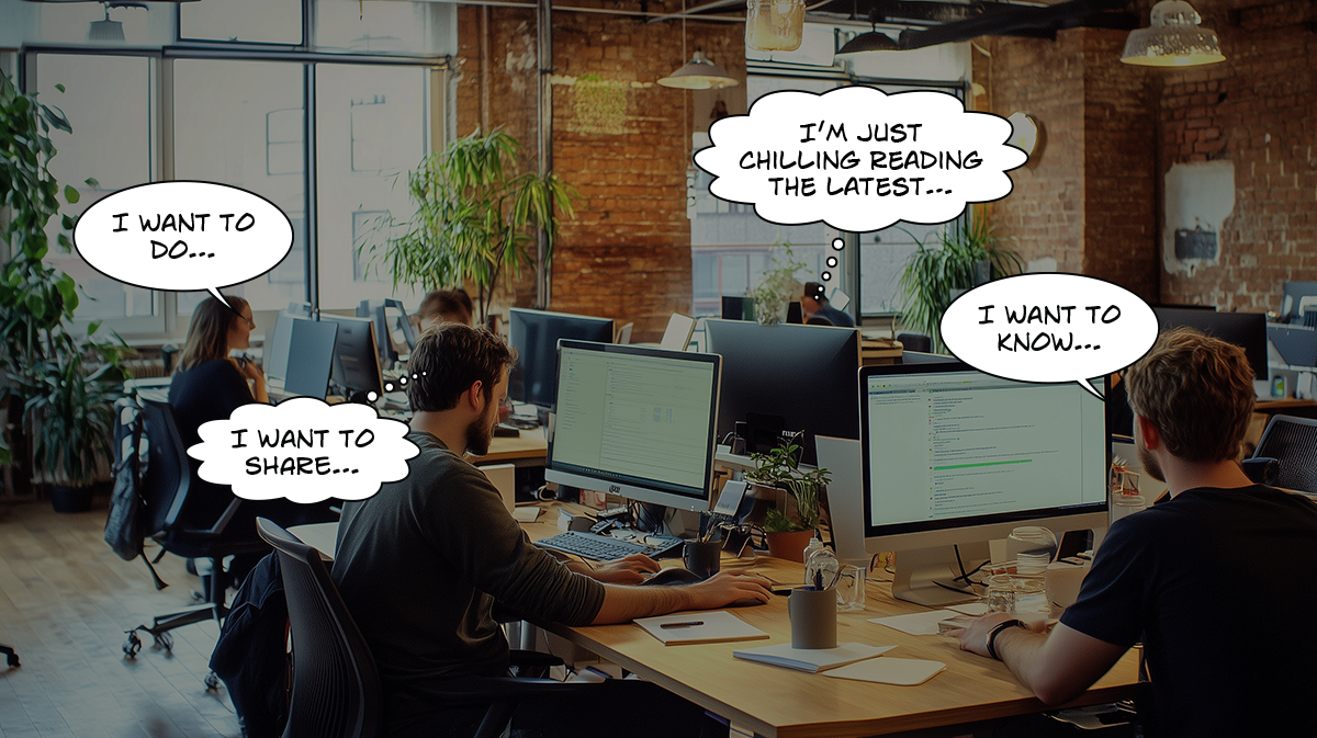
So the basic needs of intranet users are, I want to know something, I want to do something. I want to share something.
BTW, only 20-28% of text will be read!https://www.nngroup.com/articles/how-little-do-users-read/
A new approach…
I analysed the new research and presented back to the stakeholders with a set of recommendations (see list). However, these recommendations were not easy to remember, or to action without examples. This led to me creating training materials, hosting a content design workshop for the content team (UK & USA) and developing the easier to remember acronym FISH and CHIPS.
Re-writing all the new content for an intranet was a huge task an I contributed by creating more meaningful (on-brand) graphics.
Research recommendations
Make it easy to scan your content quickly e.g. use front-loaded (seal below) bulleted lists
Decide on an information hierarchy: what’s most important, less important and least important. Emphasise the most important content with higher contrast, size, or position higher up the page
Front-load paragraphs and bullet points with keywords your users are expecting to find
Keep your sentences simple and short. Use clear and simple language, that can be easily be understood by your anticipated audience
Intentionally design to create a good initial impression. Think about clear meaningful titles and simple headings and images with visual narrative (describes something relevant) and not just eye candy
Headings and sub-headings should be short, clear, simple, descriptive and in the terminology users are familiar with
Get to the main points fast. Publish calls-to-action and main points so they appear first towards the top of the page this will also help with search results pages. Then include summary information, then detailed points. This enables users to decide if the content is right for them and continue reading. This style of writing is used in newspapers and is referred to as inverted pyramid writing
Find ways to make your content interesting. Encourage users to read more. If you don’t write interesting copy users won’t read it
Organise your content into smaller chunks (paragraphs) Each chunk describes a single concept or idea only.
Outcomes
The new intranet was a huge success. Follow-up surveys reported a significant increase in user satisfaction and finally a fast search was much appreciated.
It turns out that using the “FISH & CHIPS” acronym was much easier to remember and therefore apply the recommendations to create the new content.
Some of the graphics I created for Grid:home.
Awarded - Best Intranet
Grid:home was named Best Intranet at the 2021 Institute of Internal Communications Awards. The judges praised the focus on the target audience and determination to provide the best possible user experience. Some statistics: 1,700 live pages (as of September 2021), 1.8 million searches completed, average 30 minutes time saving per employee every week, (450 hours back to National Grid every month).


