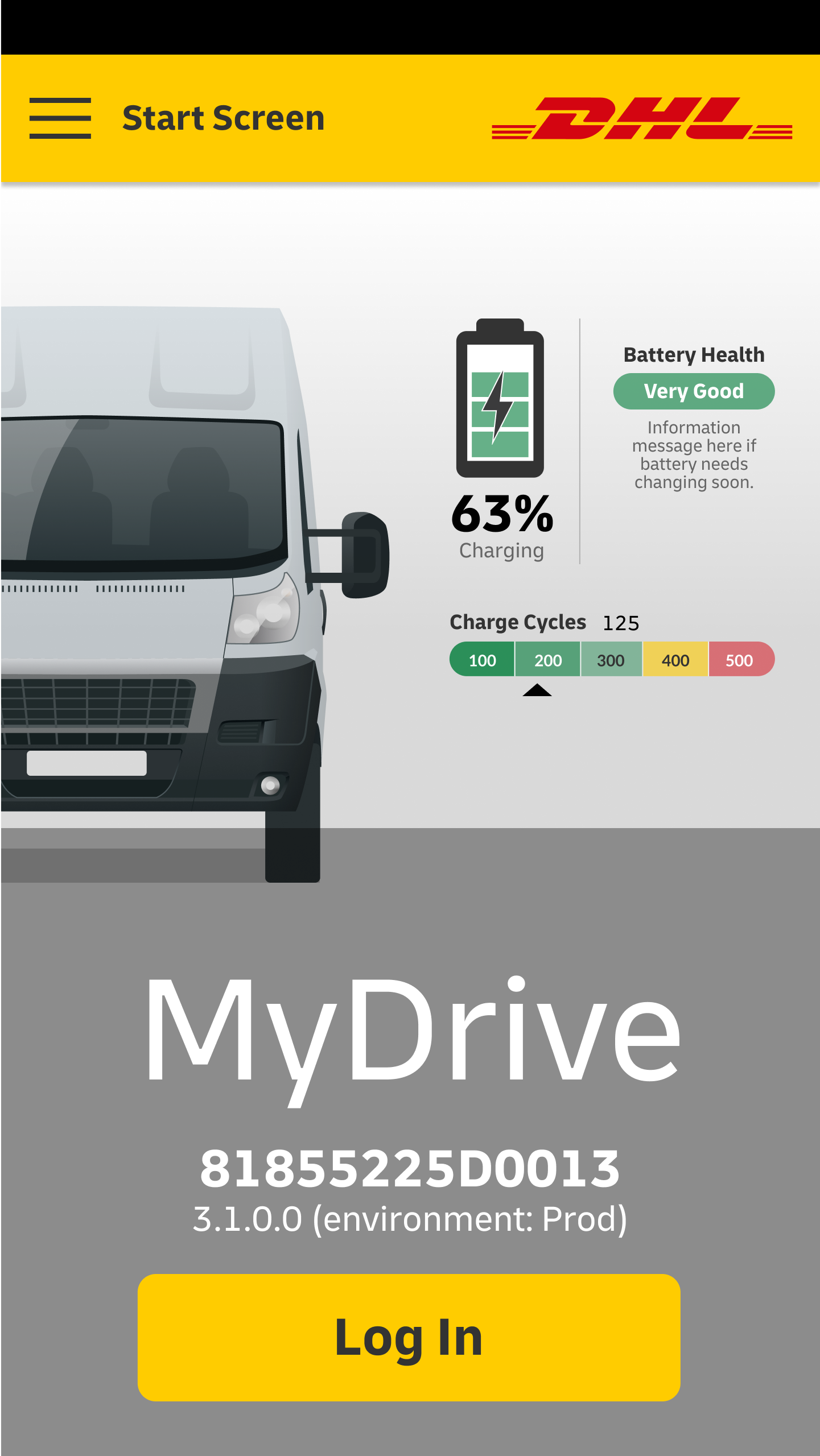
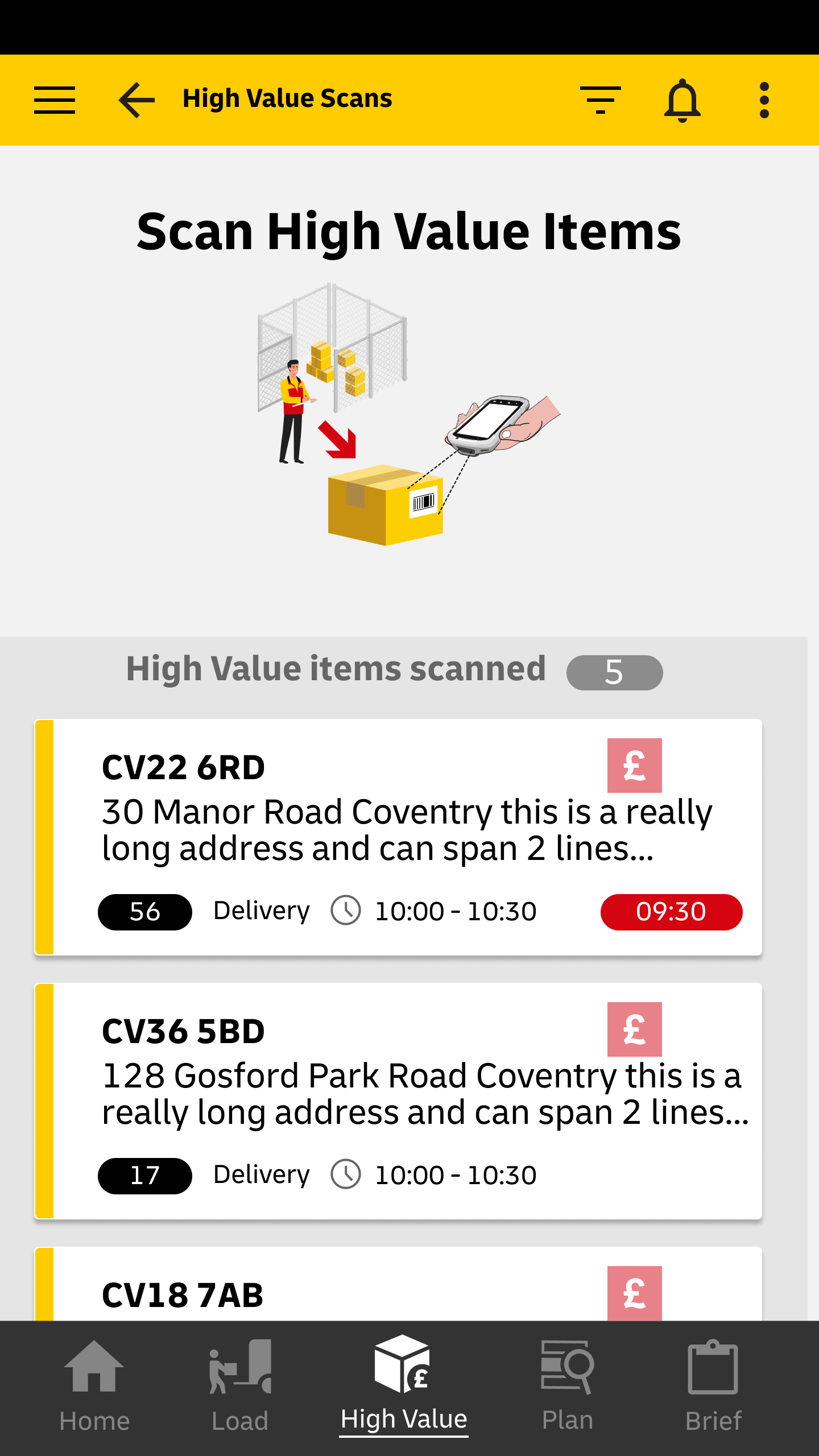
I can’t help feeling a little proud each time I sign for a delivery from DHL, knowing I’m signing using the DHL driver’s mobile App, “MyDrive” which I helped to design the UX for.
DHL
I’ve been lucky enough to work for DHL on a number of digital products from enterprise applications, warehouse management, and information dashboards to a driver delivery app.
MyDrive
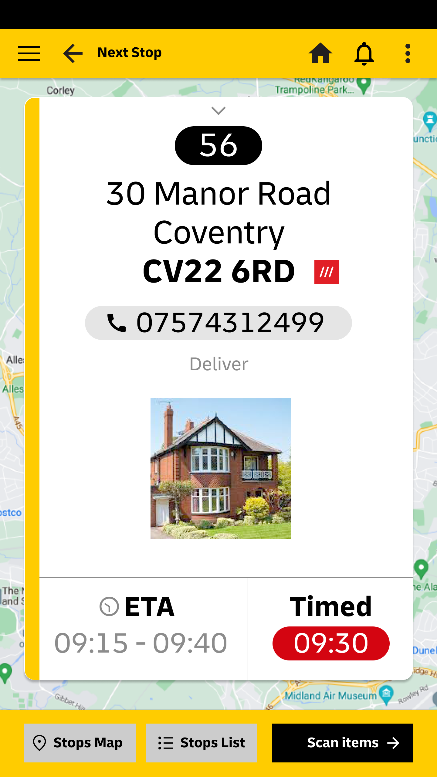
I designed the UX DHL driver delivery mobile App. including all the custom icons required.
MyDrive’s main features are:
Enable drivers to load their vehicles with parcels (in an order they choose)
Perform the necessary checks before departure, (high-value items, route planning, briefing).
Departure.
On-the-road recording of delivered, failed-to-deliver, or collections.
Debrief on return to the depot.
UX Approach
This Agile project followed a “Design Thinking” process:
Empathise
understanding user needs via interviews, spending time observing warehouse operations, relying on the SMEs and senior stakeholders and reviewing a previous legacy app. for ideas and issues.Problem Statements (Agile backlog items) were created for each sprint with UX at least 1 sprint ahead of development.
Ideating and brainstorming ideas was done collaboratively by the SMEs, development team and stakeholders with validation by selected drivers who agreed to give us UX feedback.
Prototyping I created interactive mockups using real data where I could and regularly shared with the team for review and feedback.
Testing and reviewing with SMEs then stakeholders and end-users. Often video walkthroughs were created for off-line review.


MyDash
Background
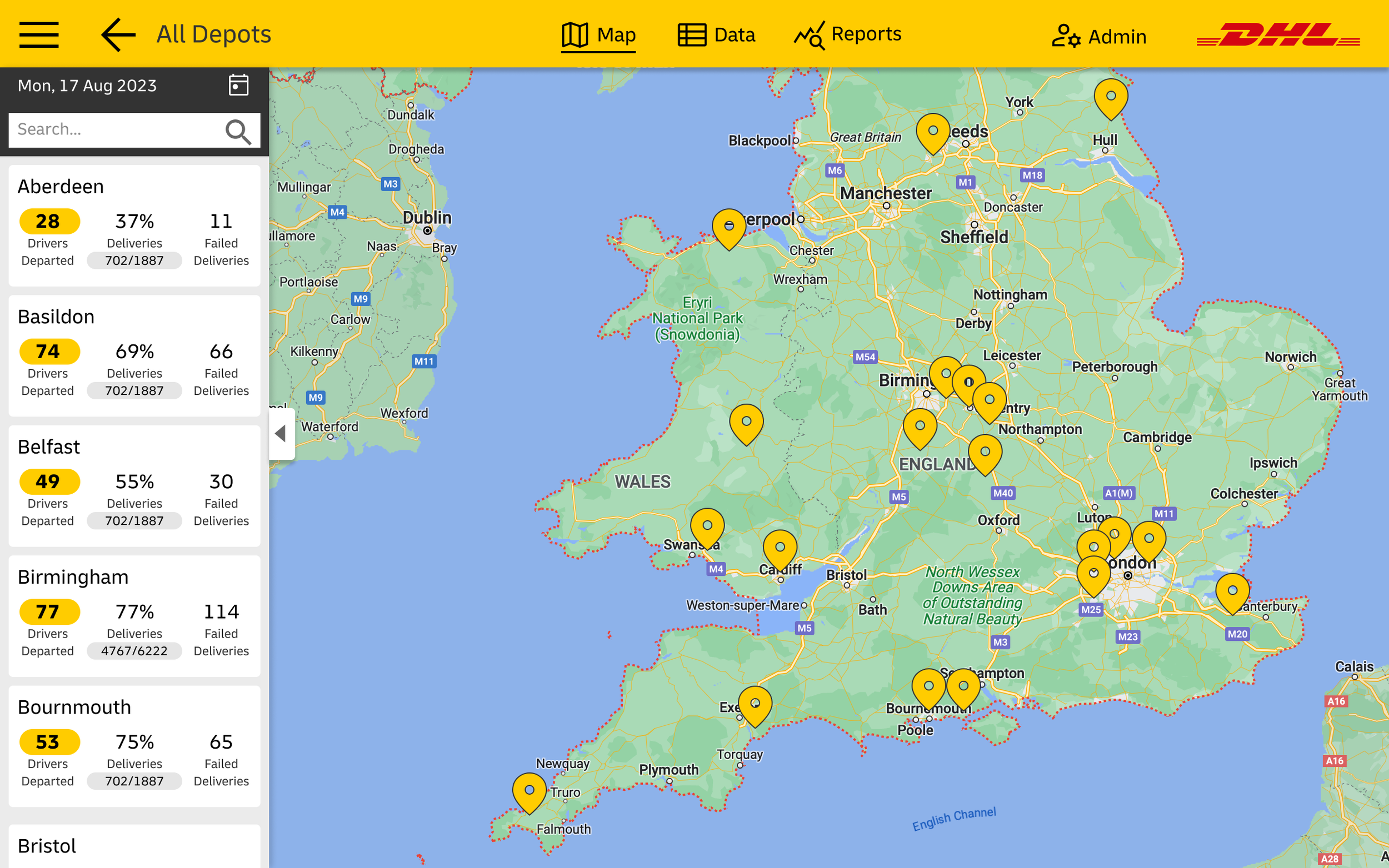
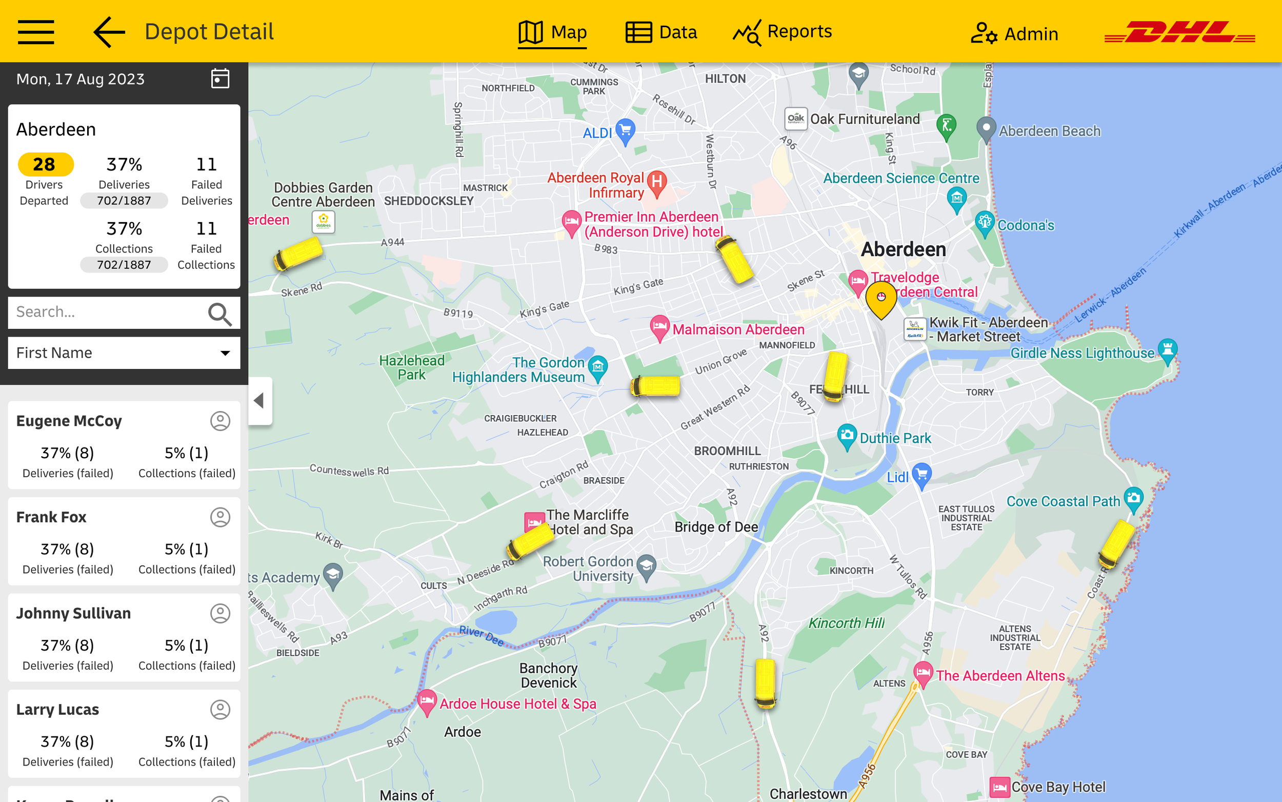
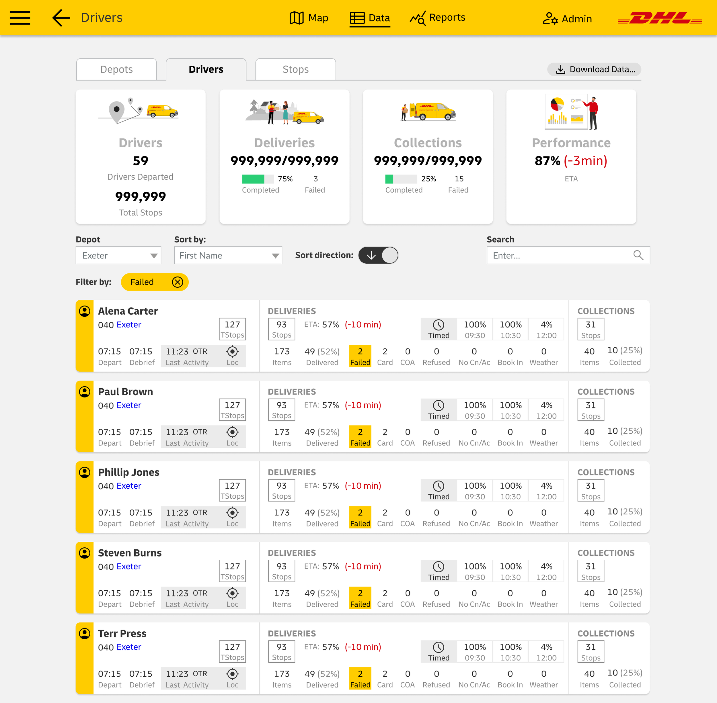
DHL asked me to design an enterprise desktop application for monitoring (in near real-time) the performance of the entire national delivery network, depots, drivers, routes and delivery stops.
UX Approach
This Agile project followed a “Design Thinking” process beginning with
Empathise - Understanding user needs via interviews
Problem Statements (Agile backlog items)
Ideating and brainstorming ideas (constrained by the data available)
Prototyping interactive mockups and 5 Testing and reviewing with the stakeholders.
Testing and reviewing with users and stakeholders


MyDepot
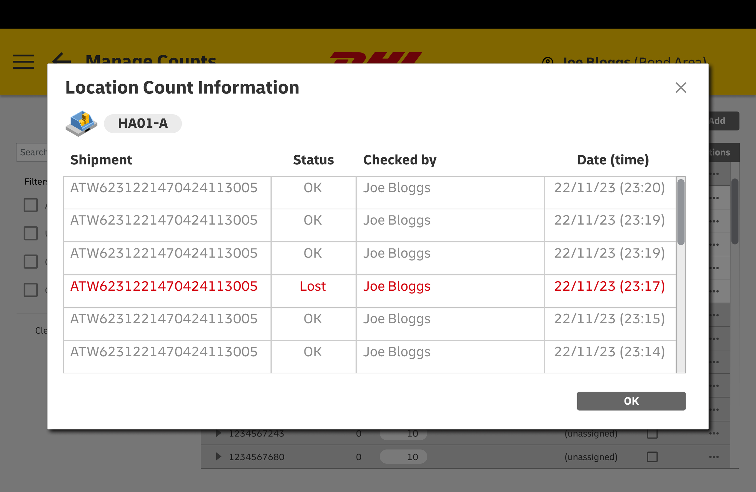
DHL’s MyDepot is a complete mobile warehouse scanning application. It enables the logistics management for controlling parcels, containers, quality control, security and transfers via totes, yorks and trailers.
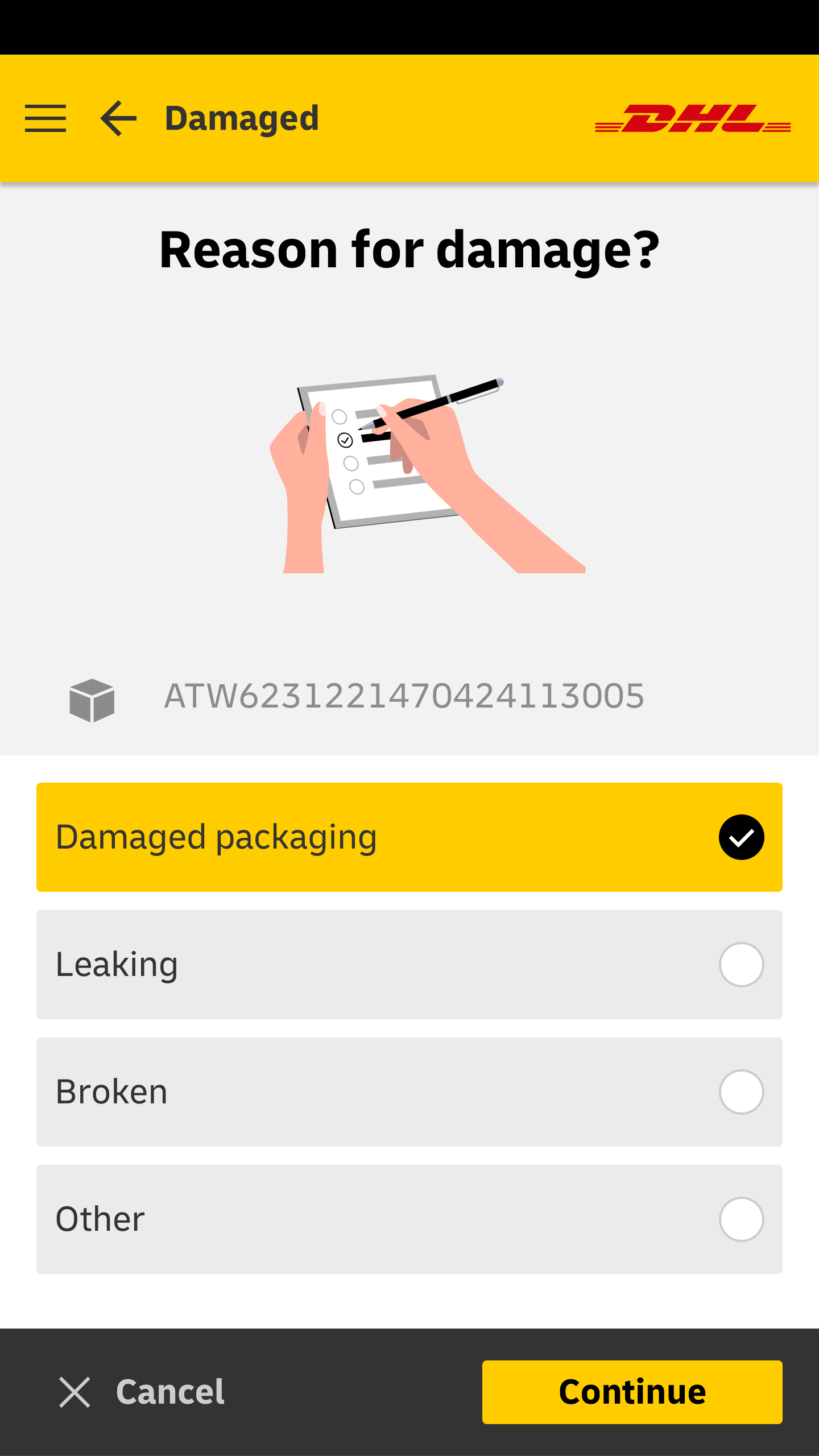
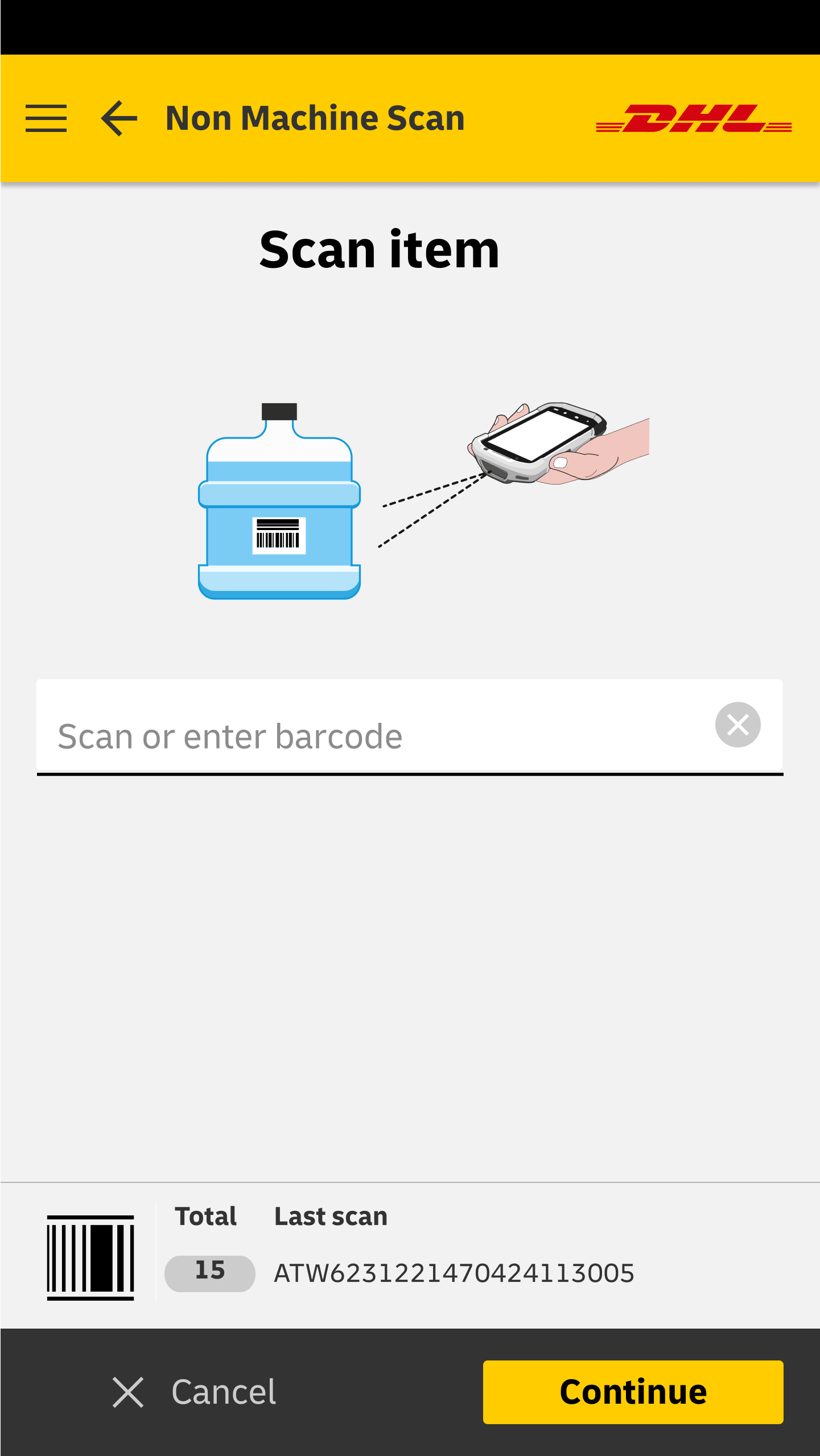
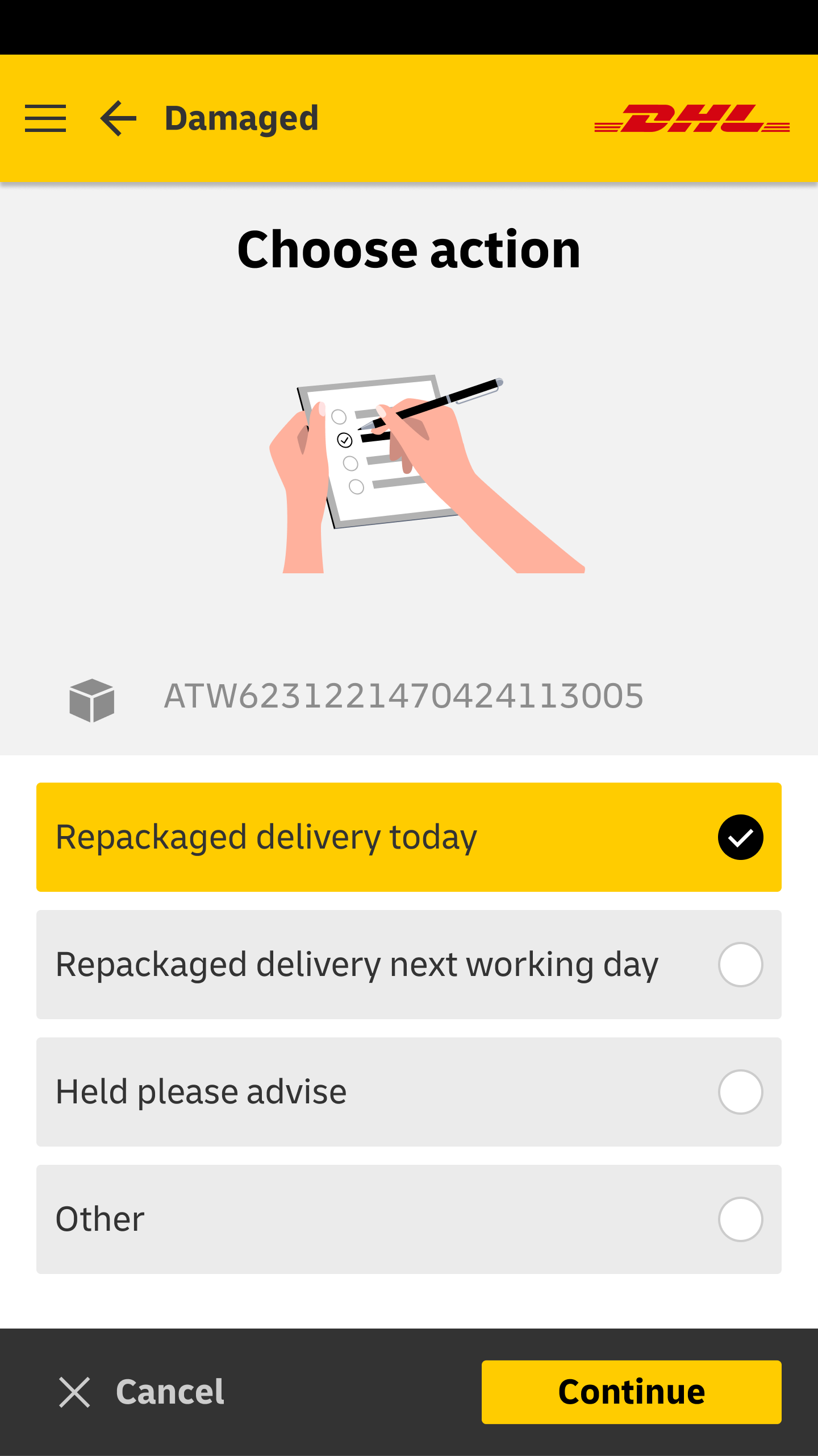
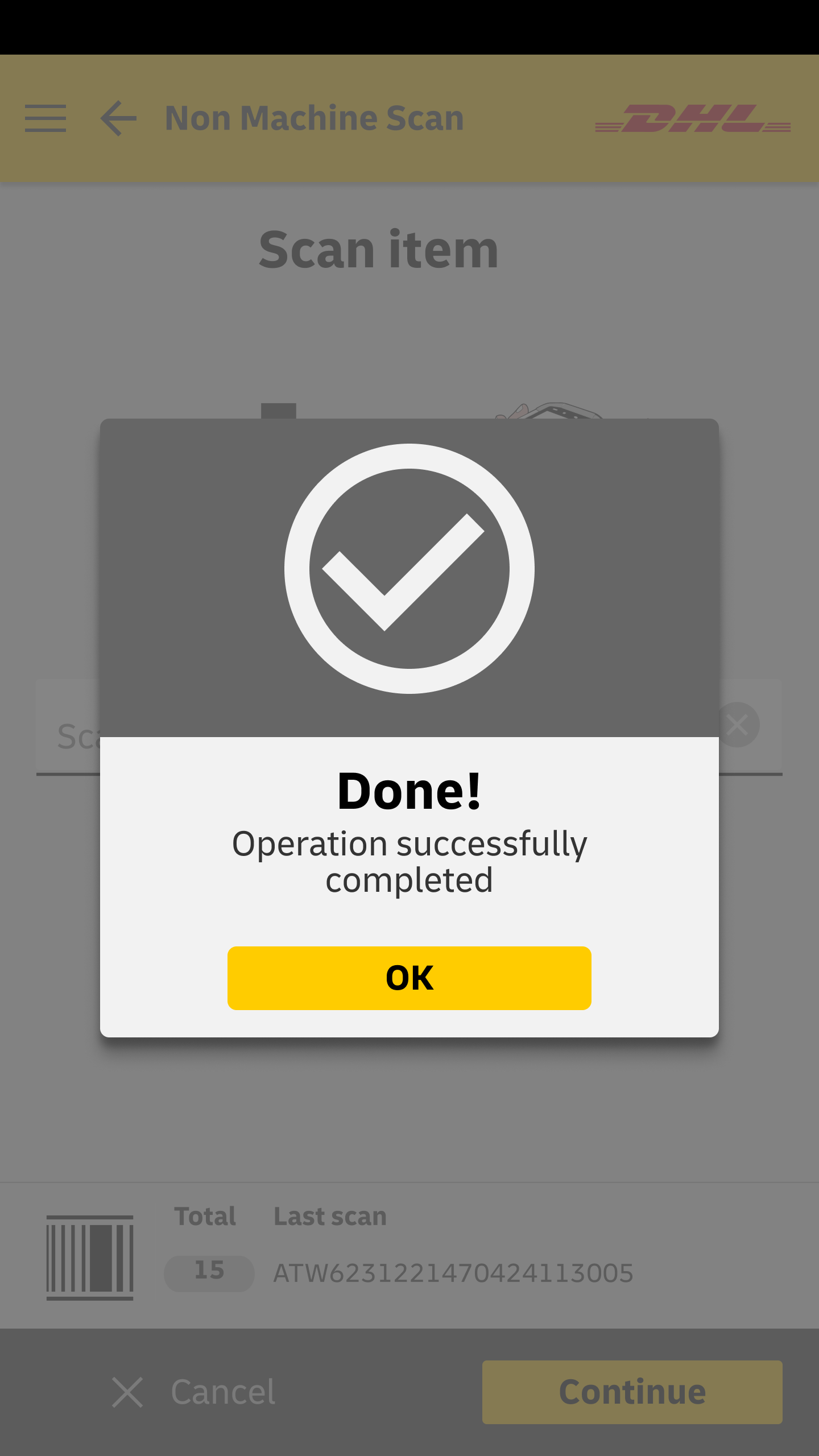
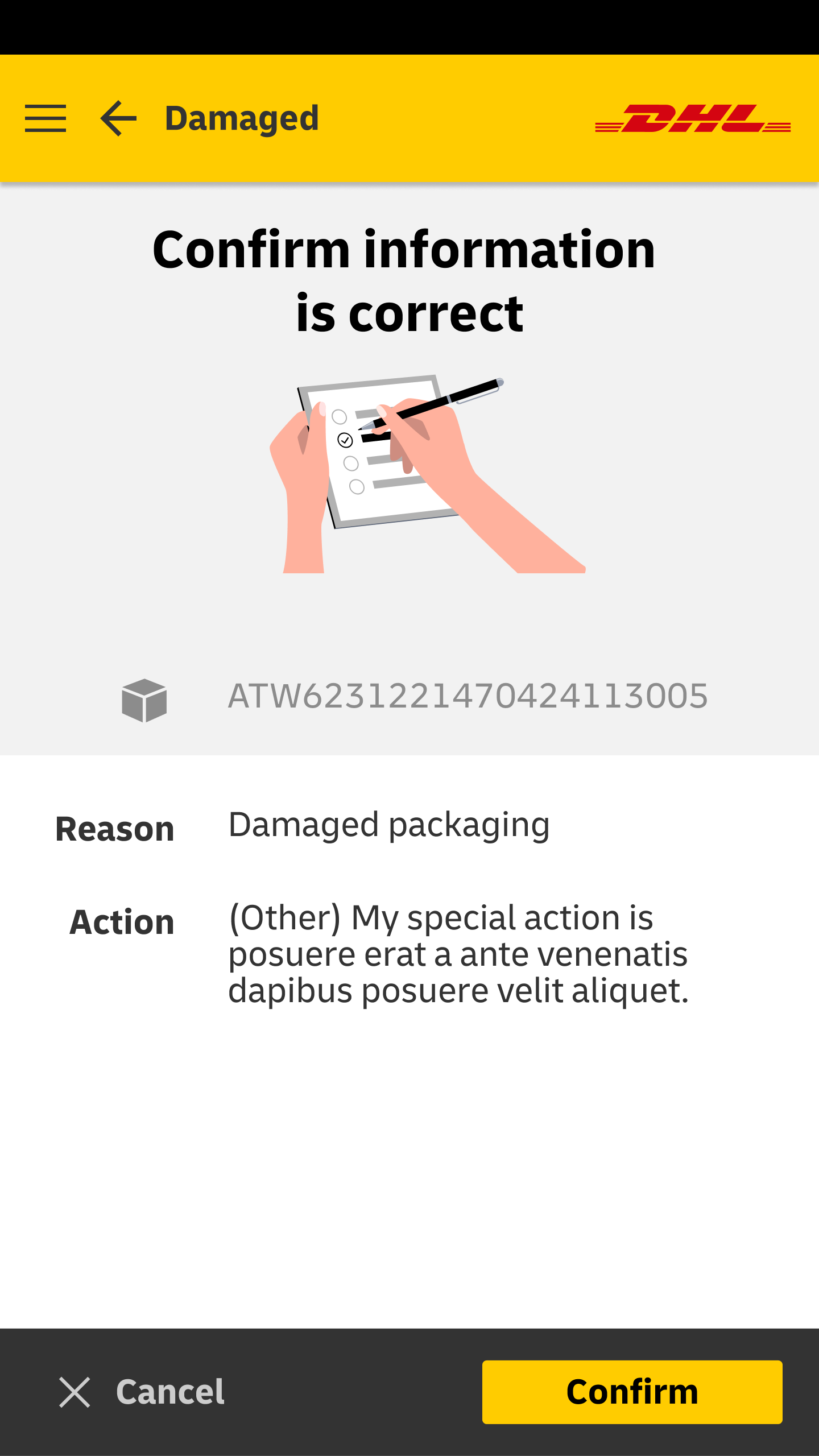
Each mobile screen is triggered by scanning a barcode, or menu selection and guides the operator through a step-by-step business process, without extensive training.
As lead UX Architect, I was responsible for research, concepts, UI design, and visual design. This particular application was developed in Axure RP Pro. then later converted to Adobe XD.

MyHub
Background
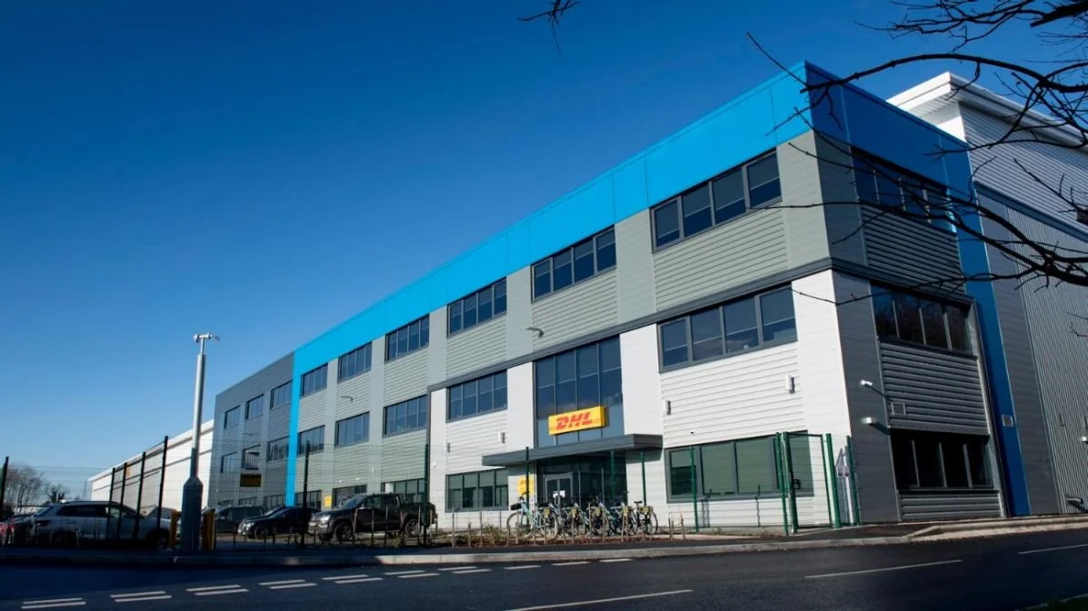
When DHL decided to build their next generation logistics hub in Coventry UK they asked me to design the UX custom apps for warehouse scanners, (hand-held), desktop and tablet.
UX Approach
The UX approach was similar to MyDepot and we could reuse many of the screens I previously designed. The UX for the hand-held scanners needed very simple and user-friendly, so they could be used with minimal training, just scan any item, and then follow the on-screen instructions. The main UX philosophy (for mobile) followed was “do one thing per screen” with haptic feedback for successful or unsuccessful scans, (audible and vibrate).
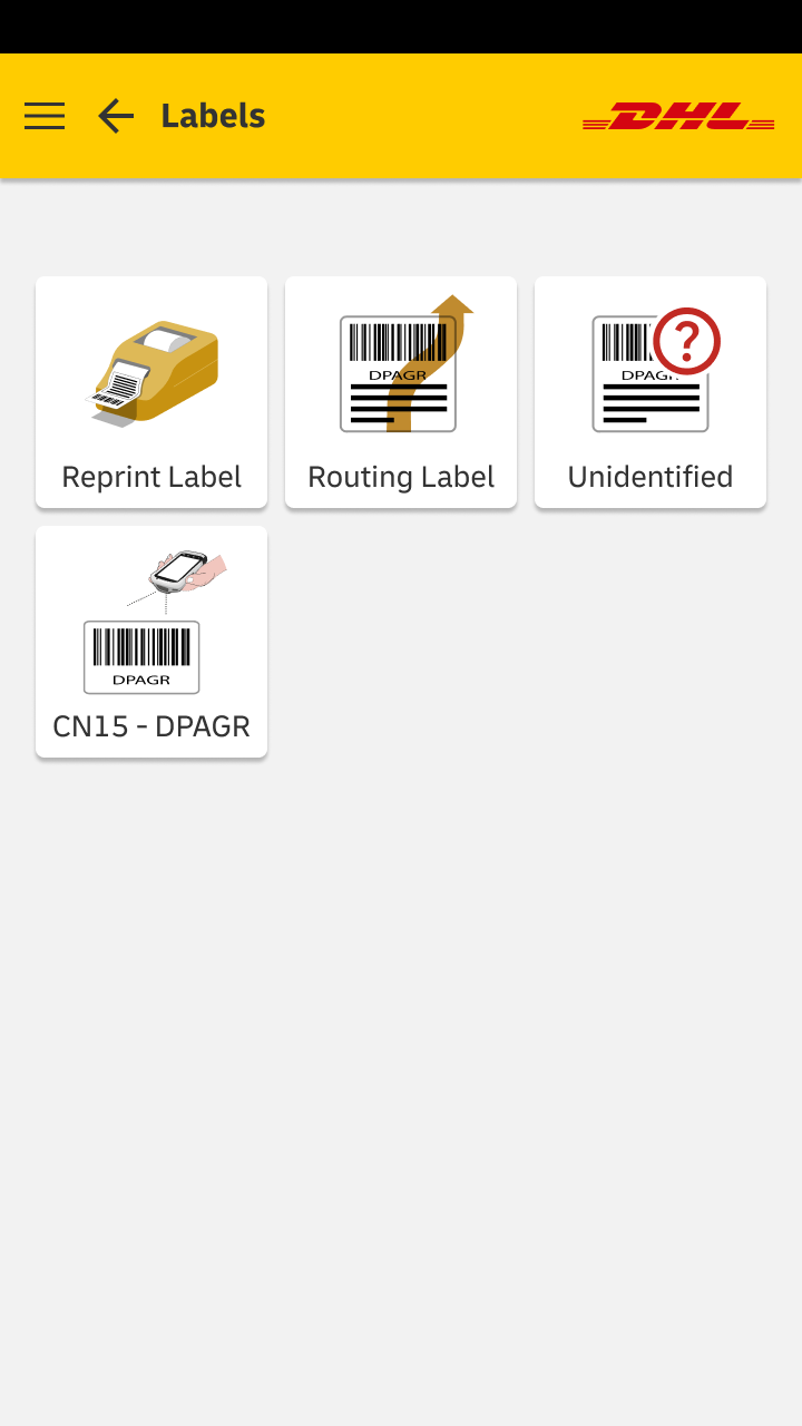
Icon Design
I created all the custom icons with “visual narrative” in mind. In other words, each icon was intended to visually communicate a task. This enhanced usability and was especially important for unfamiliar or temporary workers or users whose first language was not English.




Dynamic Postcode Updates
Background
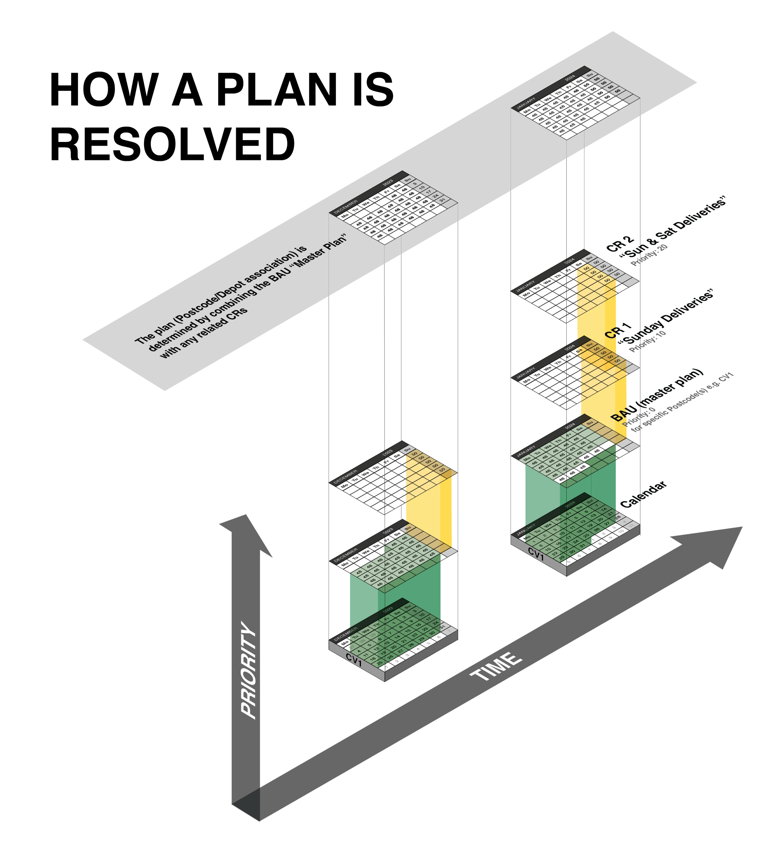
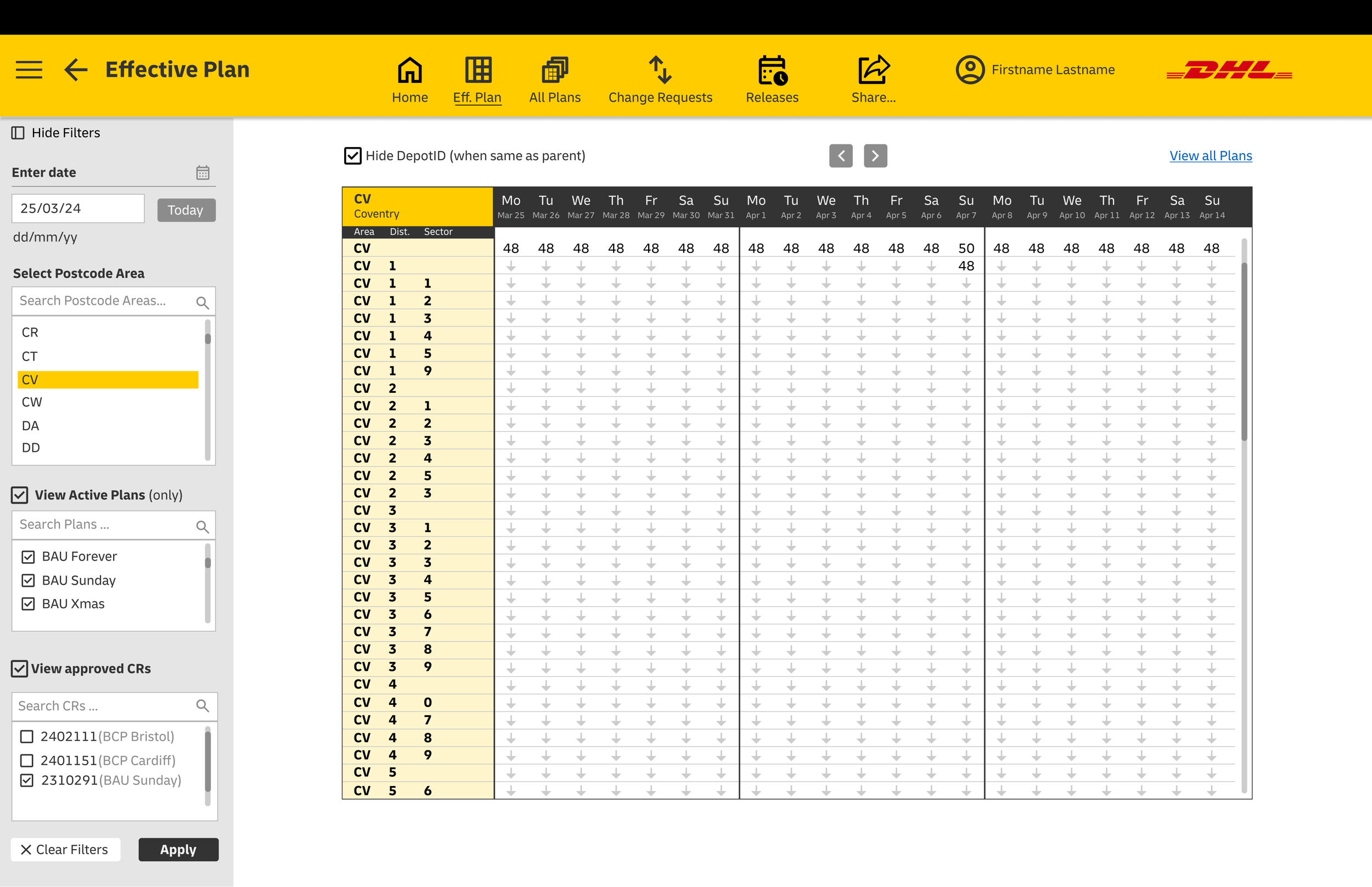
I designed the UX for an internal DHL enterprise web-based app. that manages the relationship between UK Postcodes and which DHL depots service them.
Challenges
This app. is very data Intensive. The UK has approximately 1.79 million live postcodes, that are serviced by over 50 DHL depots. Any changes to depots to postcode routing needed to be both efficient, to accommodate emergencies, but strictly controlled. Any changes made would potentially have an enormous impact on DHL’s business.
The UX design had to include the functionality previously managed via Microsoft Excel but also to include the new change control and data integrity feature the previous approach was missing.
UX Approach
The UX approach was to be as iterative as possible, using real or realistic data. The stakeholders for this internal app. included an overall product manager, system architect, senior business analyst, users of the current Excel solution and developers.
I spent a lot of time ideating, and creating concept diagrams, logical data schemas, and wireframes that to communicate different user experiences for alternate change control processes.
